Celebrating Neapolitan culture with a refined new identity for Amazon Music’s Partenopea playlist.
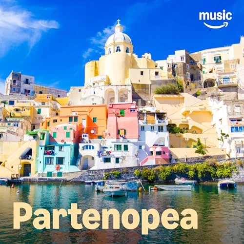
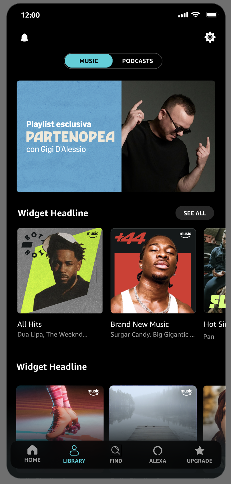
Partenopea is an Amazon Music playlist dedicated to Neapolitan and Southern Italian music, celebrating both the region’s deep cultural roots and its evolving contemporary sound. With a growing audience, the playlist needed a refreshed identity that reflected Neapolitan pride while feeling at home within Amazon Music’s ecosystem. My role was to design a new word mark and build marketing templates for social, in-app barkers, and Amazon homepage placements.
cultural research, adaptability, and collaborative design process

Amazon Music Creative Studio

The Challenge
To craft a distinct visual identity that honored Neapolitan heritage without leaning into stereotypes, while staying versatile enough to feature a wide range of artists. The design needed to feel authentic, stylish, and brand-forward, striking a balance between Amazon Music’s identity and the spirit of Naples.
the Process
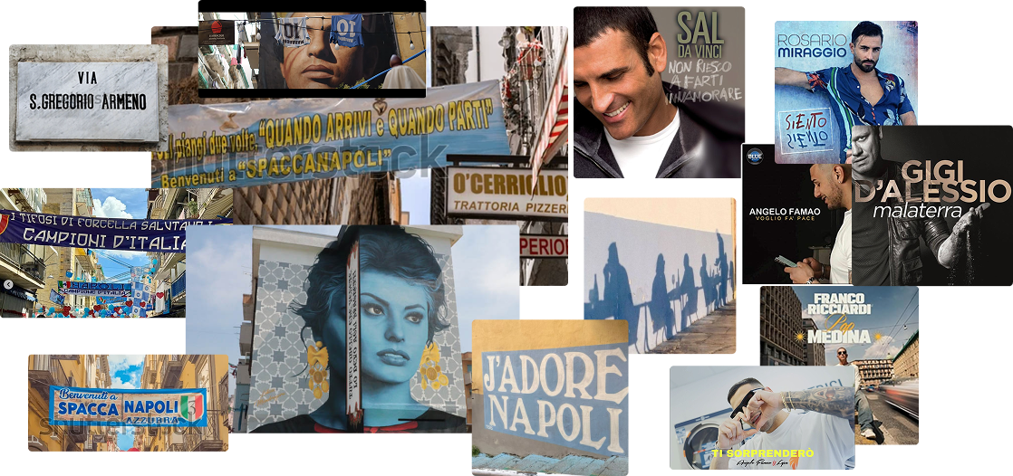
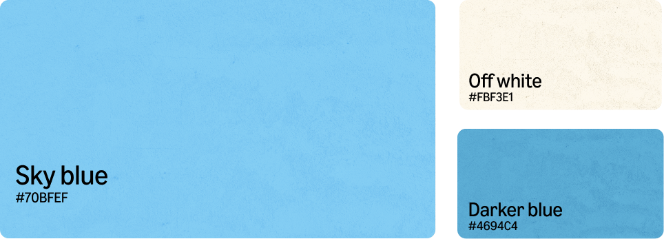
I began with a deep dive into Naples — researching its history, culture, and visual identity. I explored the aesthetics of modern Neapolitan musicians, the city’s street art, and iconic symbols like the Napoli soccer team, noting their frequent use of sky blue as a visual marker of local pride.
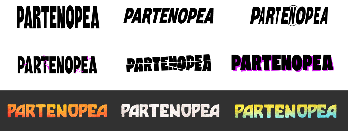
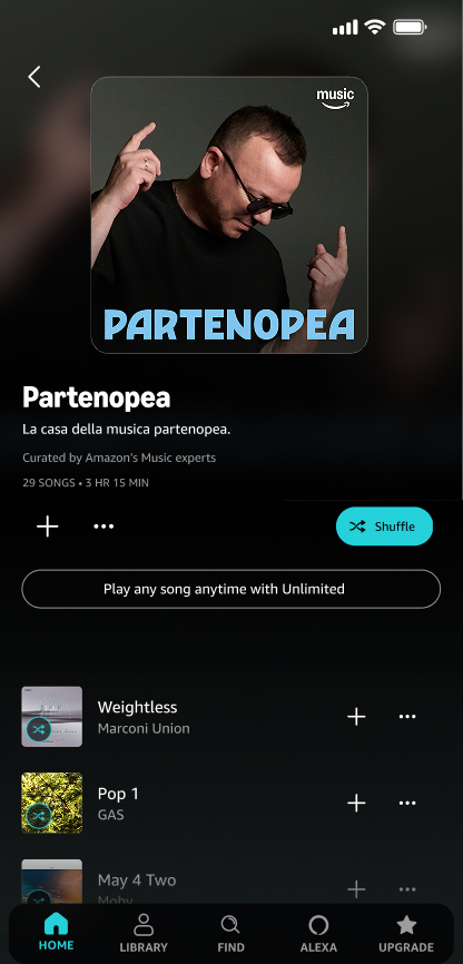
Early explorations leaned into poster-like textures, ocean-and-sun palettes, and film light leak effects to evoke warm Neapolitan days. When presenting initial concepts to the playlist’s Italian owners, they appreciated the shapes of the custom word mark but felt a cleaner, more minimal approach would allow the design to better represent all artists featured.
the Outcome
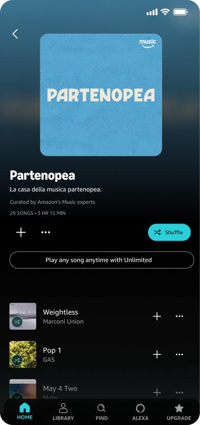
Taking their feedback, I refined the custom Amazon Music typeface:
- Smoothed and simplified letter edges
- Focused on unique character shapes to subtly reflect Naples
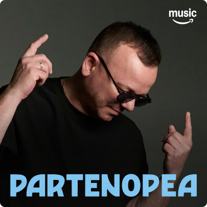
- Created a blue and off-white palette inspired by the city’s colors, ensuring full accessibility contrast compliance
The revised design struck the right balance between Naples influence and Amazon brand clarity, and received enthusiastic approval from the playlist owners, who said I had “really listened and understood the playlist and where they were coming from.”
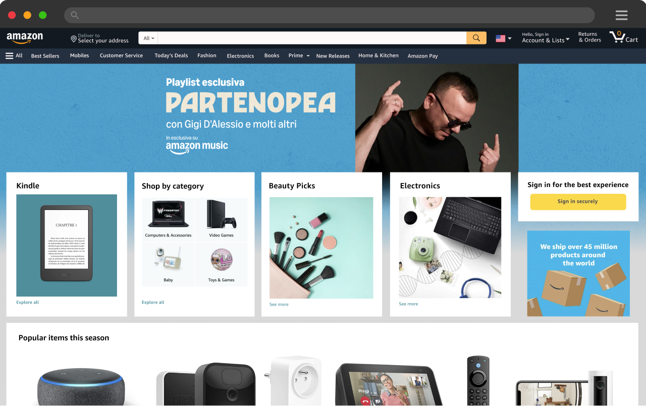
The final identity delivered a clean, confident word mark anchored in Neapolitan pride, paired with flexible templates for social, in-app, and homepage marketing. The rebrand elevated the playlist’s presence on Amazon Music, giving it a visual voice as strong and distinctive as its sound.
The successful launch helped position Partenopea as a leading space for Neapolitan music and showed the power of cultural research, creative adaptability, and cross-team collaboration in brand design.
BEFORE
aFTER
Next case study
Simplifying Cooking, Beautifully Designed -->
Celebrating Neapolitan culture
with a refined new identity for Amazon Music’s Partenopea playlist.
Partenopea is an Amazon Music playlist dedicated to Neapolitan and Southern Italian music, celebrating both the region’s deep cultural roots and its evolving contemporary sound. With a growing audience, the playlist needed a refreshed identity that reflected Neapolitan pride while feeling at home within Amazon Music’s ecosystem. My role was to design a new word mark and build marketing templates for social, in-app barkers, and Amazon homepage placements.
cultural research, adaptability, and collaborative design process
Amazon Music Creative Studio
The Challenge
To craft a distinct visual identity that honored Neapolitan heritage without leaning into stereotypes, while staying versatile enough to feature a wide range of artists. The design needed to feel authentic, stylish, and brand-forward, striking a balance between Amazon Music’s identity and the spirit of Naples.
the Process
I began with a deep dive into Naples — researching its history, culture, and visual identity. I explored the aesthetics of modern Neapolitan musicians, the city’s street art, and iconic symbols like the Napoli soccer team, noting their frequent use of sky blue as a visual marker of local pride.
Early explorations leaned into poster-like textures, ocean-and-sun palettes, and film light leak effects to evoke warm Neapolitan days. When presenting initial concepts to the playlist’s Italian owners, they appreciated the shapes of the custom word mark but felt a cleaner, more minimal approach would allow the design to better represent all artists featured.
the Outcome
Taking their feedback, I refined the custom Amazon Music typeface:
- Smoothed and simplified letter edges
- Focused on unique character shapes to subtly reflect Naples
- Created a blue and off-white palette inspired by the city’s colors, ensuring full accessibility contrast compliance
The revised design struck the right balance between Naples influence and Amazon brand clarity, and received enthusiastic approval from the playlist owners, who said I had “really listened and understood the playlist and where they were coming from.”
The final identity delivered a clean, confident word mark anchored in Neapolitan pride, paired with flexible templates for social, in-app, and homepage marketing. The rebrand elevated the playlist’s presence on Amazon Music, giving it a visual voice as strong and distinctive as its sound.
The successful launch helped position Partenopea as a leading space for Neapolitan music and showed the power of cultural research, creative adaptability, and cross-team collaboration in brand design.
Next case study
Simplifying Cooking, Beautifully Designed -->
BEFORE
aFTER